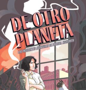
Hello, friends, all my friends: once again my blog colleagues have taken off my muzzle (metaphorically; in reality they have loosened the bridle that tied my hands so that I can type on the computer and, in the process, circulate a little blood, until next year) and expand on what, in my opinion, have been the most successful and most horrendous covers (not covers, please) of books published last year. And for another year, you are going to allow me to repeat certain points so that it is clear what my selection criteria has been, in everything else, on the other hand, quite erratic, since I have no fucking idea about graphic design and my taste in In general, even though it is exquisite, it is usually quite unappreciated. But that’s what there is…
- The books, as I have already mentioned, must have been published in the year 2023, even if they are reissues or translations of books whose originals were published many years before.
- In general, and taking into account my place of residence, these are books published in Spain or, at least, marketed here. Given that Spanish editorial production is somewhat elephantine, I have obviously only been able to see a tiny part of what was published, so I do not doubt that there are covers that are both more excellent and more horrifying than those that appear here. Anyone who wants to contribute any of their findings in this regard, please send us a comment.
- I have not judged the content of the books, but only their content (many of the ones I mention I have not read, in fact). It goes without saying that we all know wonders whose covers were painful to look at and, on the contrary, who has not been seduced by a beautiful cover that wrapped a real truñaco? Well that…
- The aesthetic criteria that I have followed is totally subjective, despite the fact that, as is known, there are objective parameters to judge an artistic creation. But I don’t know them (or, rather, I’m too lazy to apply them). Having said that, I also want to point out that I have considered, in addition to the attractiveness or lack thereof of said covers, their suitability, that is, whether they effectively fulfill the objective of covering and presenting a book that wants to be sold to a certain reading public. Finally, let go of the roll, here we gotits and tits:
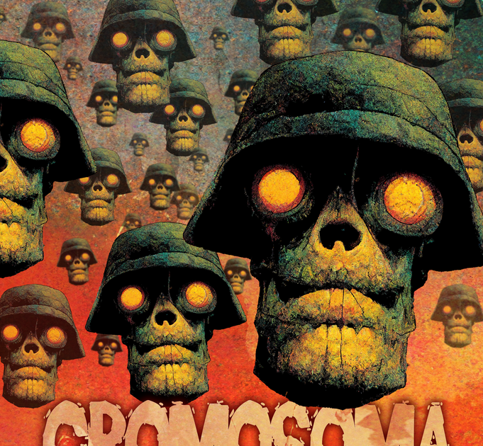
This cover amazes me. This army of flying skulls seems irresistible to me and I would undoubtedly feel attracted to this book in the middle of a table of novelties (I’m not saying that I would buy it, because I’m stiffer than a broomstick), although I perfectly understand that many people you may not like it and it may even cause you some repulsion. But let’s think: to whom is a book titled Cromosoma Splatterpunk? To those who religiously buy the Planeta prize to give as a Christmas gift or to rareheterodox connoisseurs like our partner Oriol? Do you think the latter won’t love this cover? There are no further questions, Your Honor…

– Another horror or that refers to the horror genre: Vampires in the shadows from the highly respected Pilar Pedraza. An exquisiteness, full of sense of humor, for a book that deals with the hilarious series and formerly movie, What we do in
shadows, of which this writer – and I too – seems to be a staunch fan. Logical and normal…

– If the previous cover is splendidly synthetic, let alone this second essay by Jorge Dioni on urban drift in Spain: The unrest of the cities. All you need is a few Monopoly houses and some dice for the reader to get an idea of what they can find in the text of the book. My tenths to whoever designed this cover and to the publisher for choosing it.


– To finish this section (or almost), another exquisite cover: the Spanish edition of endless Love by Scott Spencer. Be entranced by this wonder. I have no idea what the novel is about or if it’s good or bad (Koldo says it’s good), but it doesn’t matter. A preciousness.
-And if I have written that it was almost the last, it is because I still don’t know what to think about this cover, which seems to me, on the one hand, magnificently bold, as well as very appropriate for the theme of the book, white North American evangelism; but, on the other hand, I think he has, and never better put, like a Christ, two pistols… (two pistols and a rifle, in this case). I leave it to your discretion, undoubtedly more refined than mine.

Let’s go now (and I know it’s what you were waiting for, because you like blood) with the worst covers of 2023. According to my exclusive taste, I insist, it does not have to be the most accurate (although, why fool ourselves, in this regard it is):

– Construction material by Eider Rodríguez. Ok, in this case it may be that the cover is quite relevant to the book, since this one, apparently (I haven’t read it yet) is a more or less autobiographical novel that deals with the protagonist’s relationship with her father and his decline due to alcoholism. In that sense, the image on the cover and even its relative ugliness may be appropriate, even more so when the author of the illustration is the writer’s own sister. But, I’m sorry, her style, or rather this style surrounding a novel, sets me back quite a bit. I’m not saying that I wouldn’t touch it even with gloves when handling radioactive material, but I wouldn’t have ever thought of reading it either, if it weren’t for the very positive review from colleague Francesc. Don’t forget: when in doubt, always pay attention to A Book A Day…
– ¿Anyone there? by Peter Orner. Don’t screw me, head of design at CHAI editor (sorry, don’t screw me, it’s an Argentine publisher). What has poor Peter Orner done to you, who according to Google images seems like a really nice guy? Because, speaking of photos, the one you have put in this book is reminiscent of the seventies bars and restaurants that put photos of mixed dishes on the facades and that made you want to vomit more than to go in and eat there. What a sad place, for God’s sake… I’ll answer you: there is no one there because no one would enter a place like that, if they had any other option (curiously, the same publisher has published another novel by the same author, I still don’t know about youwith a cover of the same style, but which includes a much more pleasant and evocative photograph).

I don’t care if the novel takes place in its entirety in a shabby bar like that; this is the best
way to scare away potential readers, who could only feel more repelled by something like…

– Red pill by Hari Kunzru, also from an Argentine publisher (I promise you that I have nothing against you, readers from that country; quite the opposite). This cover, with that pill covered by smaller ones, as if they were ants or worms, causes me quite a bit of repulsion, which may be the desired effect, I don’t know. But, in any case, if I see it in a bookstore I won’t even go near this book, honestly. That Oriol, for example, has done it, but he has more stomach than me, don’t have any doubts about that…

– The worst possible scenario by Alejandro Morellón. But what is this, Fulgencio Pimentel? The circus has come to the city? On top of that, this book is the last Euskadi Fiction Prize, don’t miss it… EUSKADI, hell, let’s be serious. Put ikurriñas, axes and snakes, a red umbrella blurred by the rain, morroskos lifting boulders, if you want… I don’t know, the Portugalete suspension bridge, but not a fucking furby. And even less a furby that seems to come from the Drag Queen gala in Las Palmas de Gran Canaria. I shit myself, look at giving the award for this and giving it again to Fernando Aramburu, man, for God’s sake…
– Necrophilic cover for The Shrew Boy by Ana Obregón? (I don’t think she wrote it and, obviously, much less her son). Disgusting, no matter where you look at it. More comments left…


– And last, but not leasta classic could not be missing: a few months of my life, by the famous Michel. “Photochopped” and all (almost as much as Obregón), putting a photo of Houellebecq on the cover is always risky, for obvious reasons. It does not go to the extreme of a certain joint edition of three of his most famous novels (?), which Anagrama did take a risk there, but, except for the very fans of this great actor, bad writer and worse person, any possible reader who enters In a bookstore he will leave shotgun as soon as he finds this haggard face, those sickly hair and that degenerate look stalking him from the news table. What’s more, the book is, apparently, about when he had a trigger while filming a porn movie and then he tries to hide it by making a fuss about the rights or I don’t know what… what’s with that extravagant look, Michel… He is forgiven because another movie is going to be released this year (not porn, I hope) in which he stars. And, as a comic actor, this guy is a genius, I tell you.
Well, so far the best and the worst (in that way) of 2023, but now, linking to the previous book, you are going to allow me to expand for a moment on the covers of the Anagrama publishing house, which, in my opinion, have consolidated this year the trend towards a clear improvement, after a rather boring past and, about ten or twelve years ago, directly regrettable (I am referring, of course, to its “yellow” and “gray” collections, because in others, such as Compact, etc. the covers have always been much more forward). Luckily, in recent years, I already say and assume that due to a change in the direction of graphic design, they have evolved towards greater originality and beauty, largely due to the breaking of the frame or as they say, that imprisoned the old black and white photos (the era of color photos, better to forget). A few examples from the last year:


That does not mean, of course, that they will not sometimes go too far with this trend, with somewhat debatable results (an example below) or continue with their traditional b/n photo resource and running, but it is clear that they are trying of doing things well and that is always to be applauded…

And no, Anagrama does not have me on a salary, although from here I am calling Mrs. Silvia Sesé, if she reads this blog (which I am sure she does) to inform her that tips are accepted, preferably in cash and undeclared. . Always at her feet, a greeting from an admirer, a slave, a friend, a servant…
Source: https://unlibroaldia.blogspot.com/2024/01/malditas-cubiertas-doomsday-las-mejores.html